Our wordmark is the most direct and recognizable expression of Curastem. It is designed to be clear, legible, and confident, prioritizing readability and consistency across every touchpoint. The letterforms are intentionally restrained, allowing the name itself to carry meaning without relying on ornamentation.
The wordmark can scale freely across sizes and applications, but its spacing, proportions, and alignment are fixed to maintain a cohesive presence across products, services, and communications. It may appear in different color treatments or paired with supporting marks depending on context and platform, while the core structure remains unchanged to ensure continuity and recognition.
Black wordmark

White wordmark

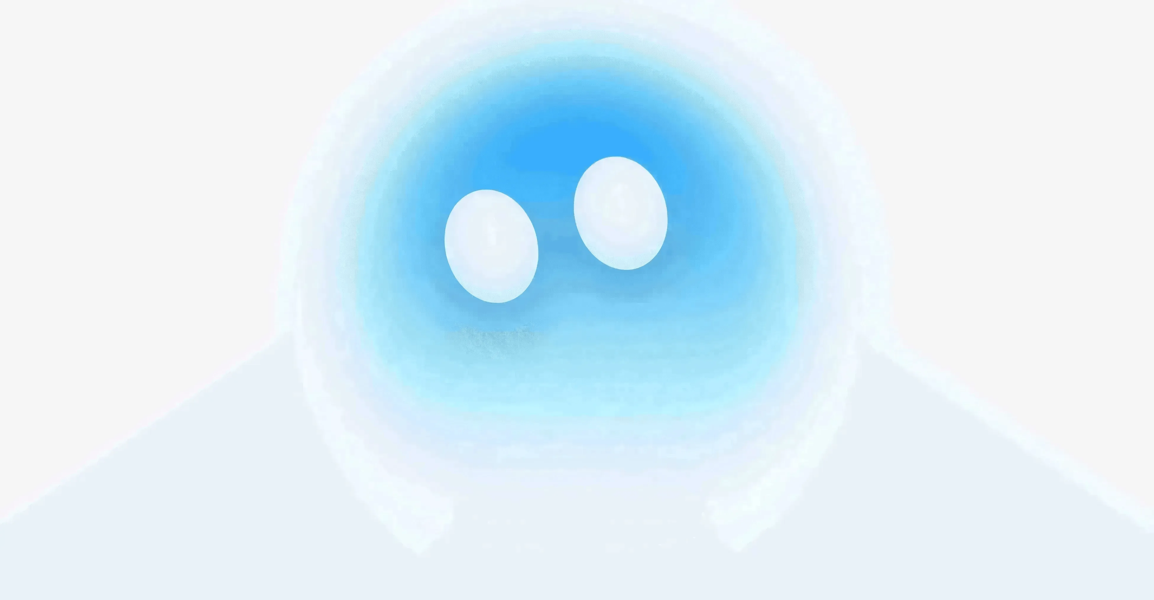
The Cura logo represents openness and accessibility, centered around a perfect “O” form that symbolizes wholeness, inclusion, and continuity. The circular geometry conveys clarity and balance, suggesting a system that is complete, transparent, and easy to enter without friction or barriers. Its soft edges and fluid gradients reinforce a sense of calm and approachability, expressing technology designed to remain open, human, and emotionally legible at every point of interaction.
Social icon

Icon

Secondary icon